# 网页常用布局
这种文章网上有很多,但是不是很全,这里我整理了一些常用的布局。
# 1. 两栏布局
这是初始的结构和公共的样式。别忘了给 html 和 body 设置高度,不然设置子盒子高度为百分比时会失效。
<div  class="wrapper base">
    <div  class="left base">123</div>
    <div  class="right base">right</div>
</div>
html,
body {
    margin: 0;
    height: 100%;
}

.base {
    right: 100%;
}

.wrapper {
    background-color: #ccc;
}

.left {
    background-color: rgb(190, 190, 204);
}

.right {
    background-color: #ccc;
}
(1)浮动
将左边的盒子浮动,定宽,右边的盒子设置 margin-left 属性。
.left {
    float: left;
    width: 320px;
}
.right {
    width: 100%;
    margin-left: 320px;
}
(2) calc函数
将左右两个盒子左右浮动,之后,左边盒子定宽,右边盒子宽度使用 calc 函数,视图宽度减去左边盒子的宽度。
.left {
    width: 320px;
    float: left;
}

.right {
    width: calc(100% - 320px);
    float: right;
}
WARNING
注意:不支持 IE9 以下的浏览器,支持 IE9。
(3) 定位
左盒子使用绝对定位,右边的盒子设置 margin-left 属性。
.left {
    position: absolute;
    width: 320px;
}
.right {
    width: 100%;
    margin-left: 320px;
}
# 2. 三栏布局
这里介绍三栏布局的四种方案,这也是面试中的常考点。本文中样式用 LESS 语言编写,所以您需要了解 LESS 语言。
这里先给 html 结构,后面一一介绍布局:
<div class="con">
    <div class="left">1</div>
    <div class="center">2</div>
    <div class="right">3</div>
</div>
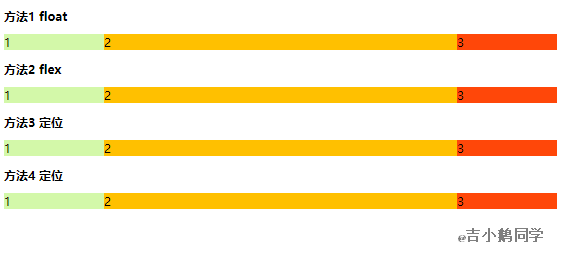
(1)浮动
浮动(float)+ 父盒子 padding + 负 margin
首先给父盒子设置左右 padding(宽度为左右盒子宽度一样),假设这里设为 100px,当然不要忘了给父盒子清除浮动。这里用 overflow: hidden; 属性来触发 BFC 清除浮动。
之后左边的盒子设置宽左浮动设置负 margin。右边的盒子也是一样,设宽右浮动设置右负 margin,中间盒子浮动设置 100% 的宽。
.con {
    overflow: hidden;
    padding: 0 100px;
    .left {
        float: left;
        width: 100px;
        margin-left: -100px;
        background-color: #DAF7A6;
    }
    .center {
        width: 100%;
        float: left;
        background-color: #FFC300;
    }
    .right {
        float: right;
        margin-right: -100px;
        width: 100px;
        background-color: #FF5733;
    }
}
(2)flex
利用 flex 很简单,让父盒子浮动,设置左右盒子的宽高,中间盒子占其他位置就可以。
.con {
    display: flex;
    .left {
        width: 100px;
        background-color: #DAF7A6;
    }
    .center {
        flex: 1;
        background-color: #FFC300;
    }
    .right {
        width: 100px;
        background-color: #FF5733;
    }
}
(2)定位
父盒子设置 position: relative; 后里面属性为 position: absolute; 的子盒子会像父盒子对齐,这个方案主要利用这个特点。
首先设置父盒子 position: relative; 这是为了子盒子像它对齐,之后设置左右 padding,宽度为左右盒子的宽,左右盒子添加 position: absolute; 属性,右盒子设置 left,top 为0即可。
.con {
    overflow: hidden;
    position: relative;

    .left {
        position: absolute;
        width: 100px;
        background-color: #DAF7A6;
    }

    .center {
        padding: 0 100px;
        background-color: #FFC300;
    }

    .right {
        position: absolute;
        right: 0;
        top: 0;
        width: 100px;
        background-color: #FF5733;
    }
}
(2)圣杯布局
这种布局方案,优先加载中间区域的内容,有利于用户体验。
<div class="con3 ">
    <div class="center col">2</div>
    <div class="left col">1</div>
    <div class="right col">3</div>
</div>
将三个盒子都左浮动,设置父盒子的 padding 设为为左右盒子的宽相等, 左盒子设置 margin-left: -100%; 后与中间盒子的最右端对齐,再利用定位 position: relative; left: -100px; 想左移自己的宽的即可。中间盒子设置 100% 宽度, 右边盒子设置 margin-right: -100px 即可。
.con3 {
    overflow: hidden;
    padding: 0 100px;
    .col {
        float: left;
    }

    .center {
        width: 100%;
        background-color: #FFC300;
    }

    .left {
        position: relative;
        left: -100px;
        width: 100px;
        margin-left: -100%;
        background-color: #DAF7A6;
    }

    .right {
        width: 100px;
        margin-right: -100px;
        background-color: #FF5733;
    }
}